 to select from the View drop-down list in the toolbar.
You can choose different views for the reports.
To switch views for presentations:
1 Click to select from the View drop-down list in the toolbar.
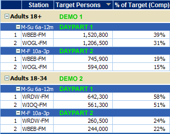
• Table — The most common view and available for all markets. When you choose multiple demos and dayparts, they display in the order of selection from top to bottom in the table.
Example with two demos and two dayparts...
• Graph — The "sort by" estimate is charted for the selected stations. If you sort a report alphabetically (by station), Tapscan cannot display a graph — which results in a blank chart and a message to change the sort estimate.
Although a graph can include up to 50 stations, limit stations by:
– Reducing the Display Top number (upper-right corner of report)
– Selecting specific call letters in the Stations to Graph list.
– See Related topics... for more information about graphing for presentations.
• In the Instant Qualitative Profile report:
– % — The default view shows estimates of the target audience composition as percentages in pie charts and bar graphs.
– Persons — Displays estimates in graphs for target persons in thousands (000s).
– Index — Shows relationships between an audience and a product or activity as a ratio in percentage terms that relates a number to a base of 100.
• In the Target Profile report:
– By Category — Displays qualitative data in the order of your WHAT selections. You can sort by category/question/answer.
– Cross Category — Shows qualitative criteria items in sentence format (for Scarborough datasets) or Question: Answer format (for Retail Direct or Qual Diary) and sorted by a selected estimate based on the WHO selection. You can sort by the WHAT column to recreate the category (WHAT) view.
Related topics...